A premium brand identity system for an eco-conscious coastal property developer built around sanctuary, architectural restraint, and oceanic calm.
Azure Bay needed a brand identity that could speak to high net-worth investors seeking a quieter kind of coastal luxury - real, not performative. The brief called for an identity that avoided resort clichés, leaned into sustainable coastal living, and expressed precision through the lens of Invisible Luxury.
Branding lives between loud extremes. We worked to develop a space of considered, invisible luxury - rooted in land and sea. Azure Bay needed to occupy a strategic space - one that was aspirational, calm, and never exaggerated. Not Resort (too loud/leisure). Not Corporate (too formal/transactional). Not Heritage (too traditional/classic).
Word Association, Visual Ideation, Concept Refinement.
A refined monogram where architecture meets ocean. The mark is engineered for clarity, balance, and enduring beauty. A = architecture/shelter/peak. B = bay/cove/enclosure. Horizon = calm/premium outlook. Waves = contour lines - land+water integration. Whole mark = Invisible Luxury.
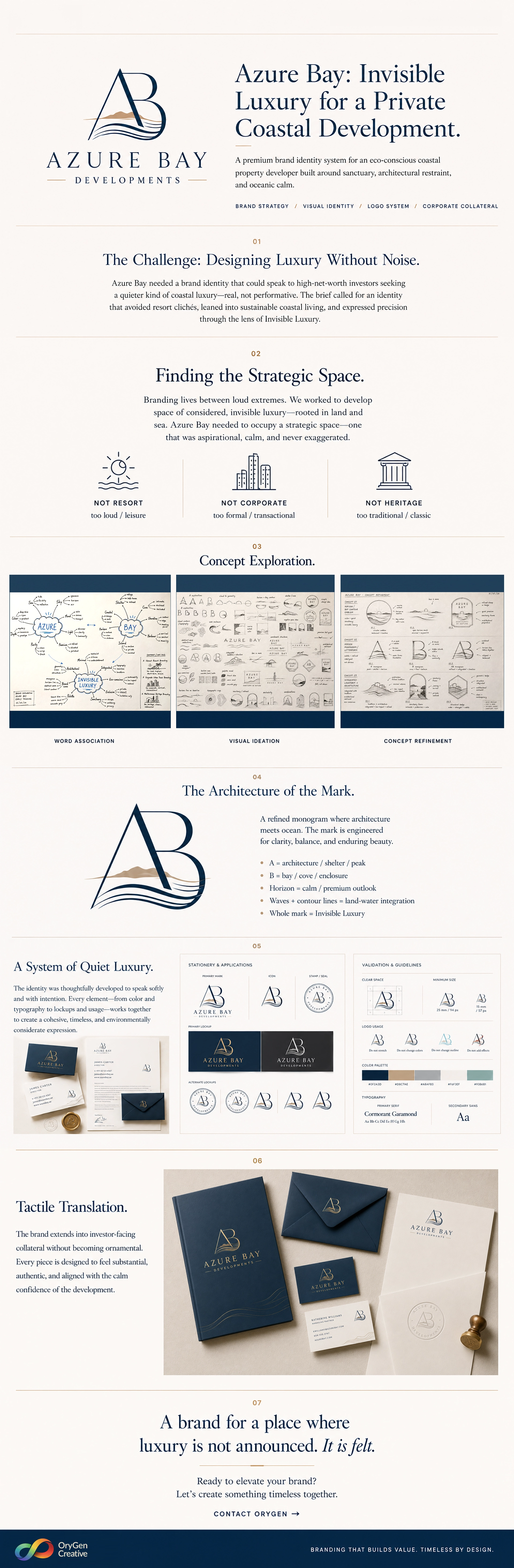
The identity was thoughtfully developed to speak softly and with intention. Every element - from color and typography to lockups and usage - works together to create a cohesive, timeless, and environmentally considerate expression.
The brand extends into investor-facing collateral without becoming ornamental. Every piece is designed to feel substantial, authentic, and aligned with the calm confidence of the development.
Ready to elevate your brand? Let's create something timeless together. Contact Orygen Creative.